Monday, 12 December 2011

'A man paints with his brain not with his hands' Michelangelo

Once more into the breach dear friends, once more' by shakespeare

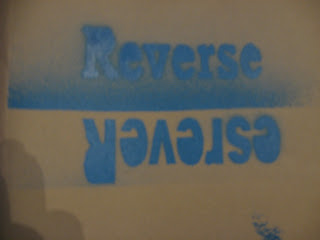
These pieces of work were done for a typographgic quotes project at college, the brief stated that we had to create two A2 pieces of work on famous quotes, one art based quote and one general life quote.

The top piece was done on photoshop, I put the text on first then put the dots on individually, after putting all the dots on I deleted the type with the parts of the dots behind it. My inspiration for this one came from a piece of work I saw at college, the piece had been done by hand, but I thought that a digital piece would give it a more proffesional look.

The second piece was purely hand made, I did and experiment with embossing paper with type, the turned out okay but the it was quite hard to read overall, I then thought about putting ink onto my hand cut letter and creating a make-shift letter press in the print room, i chose the red and blue because, the quote had a british theme so I thought of red, white and blue, if I could go back and try again I would arrange the colours to look more like the Union Jack flag.I also think that because my letters were hand cut and not all straight, it adds a little character to the piece and is not a clean cut as my other.


Overall I am very pleased with my final outcomes and they are worthy of going in my portfolio.

Tuesday, 4 October 2011

Typographic artists and research

Paul Friedrich August Renner
Paul Renner was born on the 9th august in 1878 and was a typographer, his most recognisable type face was Futura, it is a geometric sans serif and was used mainly in the 20th century. They say he created a new set of quidelines for a good book design, i think that because the typeface is easy to read, I can see why book publishers liked to use it. During nazi power Renner was arrested in germany for his book “Kultur-bolschewismus?” (Cultural Bolshevism?)  unfortunatly he couldnt find a german publisher to make it come to life but the nazis still arrested him.


Arthur Eric Rowton Gill

Eric Gill was born on the 22nd of February 1882 and died on the 17th November 1940. In 1925 Gill designed Perpetua typeface, the upper case letters based on monumental Roman inscriptions. The typeface was also named after his daughter Petra. After Perpetua, Gills sans typeface was born based on the sans serif lettering originally designed for London underground. He was involved in the design for the underground typeface but he dropped out before the project was completed. In the re-design of penguin books Gills sans was set as the typeface for the books in the Penguin Composition Rules by Jan Tschichold.


Hyroglifics
Hyroglifs are from the acient egyptians, they were used just like our letters are today, they depicted a word as a symbol. They were found in most of the pyramids, describing the people that were buried there. they are some of the first signs of wording and putting sentences together.    

Illuminated manuscript
Illuminated manuscripts were very popular in the 13th century, it is where a piece of manuscirpt, often the bible, was copied but with decorative initials and borders, the more expensive ones were decorated in gold and silver. Getting towards the late middle ages people started to do illuminated manuscripts onto paper and the first sort of books were then created, but still everything had to be hand written. 


Letterpress History
Letterpress printing is relief printing of text and image using a press with a "type-high bed" printing press and movable type, in which a reversed, raised surface is inked and then pressed into a sheet of paper to obtain a positive right-reading image. It was the normal form of printing text from its invention by Johannes Gutenberg in the mid-15th century until the 19th century and remained in wide use for books and other uses until the second half of the 20th century. In addition to the direct impression of inked movable type onto paper or another receptive surface, letterpress is also the direct impression of inked printmaking blocks such as photo-etched zinc "cuts" (plates), linoleum blocks, wood engravings, etc., using such a press.


Monday, 28 February 2011

Lucian Freud

Lucian Freud
Jack Fearn

Lucian Freud was on the 8th December 1922, in Austria but as a British citizen. He was most well known for his thick brush stroked portraits and his figure paintings. He was one of the best painters of his time. I think that he is a really good painter when you are looking at portrait artists because his style is unique and could be used for inspiration for others work.   
One of the paintings I like is called reflection which is a portrait of himself, it was done by acrylic paint. I really like this painting because it is of himself and normally people who paint themselves they paint it so they look beautiful but Lucian’s style isn’t like that he paints people how he sees them which I think is the best way to paint people.  I like how he has kept the colours neutral and has used his trade mark brush strokes.
Another favourite of mine is a pen drawing named Susanna, I really like his pen drawings because they are so life like, also the amount of detail he gets in the pictures is incredible. I really like the detail in the eyes and how life like they are.  Also I like how her hair glistens in the light, he does this by doing a series of strokes one way then and then a series of brush strokes the other way down from other to make a spot that is highlighted.
I also like a painting called ‘a man’s head, ‘ it is one of his earlier paintings of himself, it lacks slightly in detail but this is what I like about the painting, it is simple but effective.  I think that he used this painting for inspiration for ‘reflection’ because it is the same angle and the same medium.  

Monday, 14 February 2011

Monday, 7 February 2011

Tuesday, 1 February 2011

illustration friday


This week the word was dusty. these are my ideas. these are just quick sketches i did for the 'Dustbusters and Captain Dust'. Personally i think i could have done better.   

Monday, 24 January 2011

illustration friday

This was a little project i did for Illustration Friday, i based my work on Debbie Smyth.


I showed this to my peers at Chesterfield college for a crit. The main pieces of feedback was to paint my board white to make it stand out from the rest and to have used thicker wool instead of cotton to make the chicken stand out more and to define it more.

Monday, 10 January 2011

greenwash summary

This is a summary of Greenwash GuideGreenwash is found in advertising, PR or on packaging and is when a company says that something is greener or greener than a rival company when it isn't. Greenwash can be missleading but is not illegal. 


The 10 signs of a greenwash
 1. Fluffy language - words orterms with no clear meaning.
2. Green Products V Dirty Company - Such as efficient light bulbs made in a factory which pollutes rivers.
3. Suggestive Pictures - Green images that indicate a green impact e.g. flowers blooming from exhaust pipes.
4. Irrelevant Claims - Empasising one tiny green attribute when everything else is un-green.
5. Best in Class - Declare you are slightly greener than the rest even if the rest are pretty terrible. 
6. Just not credible - 'Eco friendly' cigarettes anyone? 'Greening' a dangerous product doesn't make it safe. 
7. Gobbledygook - Jargon and information that only a scientist could check or undertand.
8. Imaginary friends - A 'label' that looks like a third party endrsement... except its made up 
9. No proof - It could be right, but where's the evidence? 
10. Out-right lying - Totally fabricated claims or data.