Monday, 12 December 2011

'A man paints with his brain not with his hands' Michelangelo

Once more into the breach dear friends, once more' by shakespeare

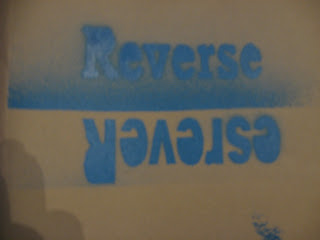
These pieces of work were done for a typographgic quotes project at college, the brief stated that we had to create two A2 pieces of work on famous quotes, one art based quote and one general life quote.

The top piece was done on photoshop, I put the text on first then put the dots on individually, after putting all the dots on I deleted the type with the parts of the dots behind it. My inspiration for this one came from a piece of work I saw at college, the piece had been done by hand, but I thought that a digital piece would give it a more proffesional look.

The second piece was purely hand made, I did and experiment with embossing paper with type, the turned out okay but the it was quite hard to read overall, I then thought about putting ink onto my hand cut letter and creating a make-shift letter press in the print room, i chose the red and blue because, the quote had a british theme so I thought of red, white and blue, if I could go back and try again I would arrange the colours to look more like the Union Jack flag.I also think that because my letters were hand cut and not all straight, it adds a little character to the piece and is not a clean cut as my other.


Overall I am very pleased with my final outcomes and they are worthy of going in my portfolio.

Tuesday, 4 October 2011

Typographic artists and research

Paul Friedrich August Renner
Paul Renner was born on the 9th august in 1878 and was a typographer, his most recognisable type face was Futura, it is a geometric sans serif and was used mainly in the 20th century. They say he created a new set of quidelines for a good book design, i think that because the typeface is easy to read, I can see why book publishers liked to use it. During nazi power Renner was arrested in germany for his book “Kultur-bolschewismus?” (Cultural Bolshevism?)  unfortunatly he couldnt find a german publisher to make it come to life but the nazis still arrested him.


Arthur Eric Rowton Gill

Eric Gill was born on the 22nd of February 1882 and died on the 17th November 1940. In 1925 Gill designed Perpetua typeface, the upper case letters based on monumental Roman inscriptions. The typeface was also named after his daughter Petra. After Perpetua, Gills sans typeface was born based on the sans serif lettering originally designed for London underground. He was involved in the design for the underground typeface but he dropped out before the project was completed. In the re-design of penguin books Gills sans was set as the typeface for the books in the Penguin Composition Rules by Jan Tschichold.


Hyroglifics
Hyroglifs are from the acient egyptians, they were used just like our letters are today, they depicted a word as a symbol. They were found in most of the pyramids, describing the people that were buried there. they are some of the first signs of wording and putting sentences together.    

Illuminated manuscript
Illuminated manuscripts were very popular in the 13th century, it is where a piece of manuscirpt, often the bible, was copied but with decorative initials and borders, the more expensive ones were decorated in gold and silver. Getting towards the late middle ages people started to do illuminated manuscripts onto paper and the first sort of books were then created, but still everything had to be hand written. 


Letterpress History
Letterpress printing is relief printing of text and image using a press with a "type-high bed" printing press and movable type, in which a reversed, raised surface is inked and then pressed into a sheet of paper to obtain a positive right-reading image. It was the normal form of printing text from its invention by Johannes Gutenberg in the mid-15th century until the 19th century and remained in wide use for books and other uses until the second half of the 20th century. In addition to the direct impression of inked movable type onto paper or another receptive surface, letterpress is also the direct impression of inked printmaking blocks such as photo-etched zinc "cuts" (plates), linoleum blocks, wood engravings, etc., using such a press.


Monday, 28 February 2011

Lucian Freud

Lucian Freud
Jack Fearn

Lucian Freud was on the 8th December 1922, in Austria but as a British citizen. He was most well known for his thick brush stroked portraits and his figure paintings. He was one of the best painters of his time. I think that he is a really good painter when you are looking at portrait artists because his style is unique and could be used for inspiration for others work.   
One of the paintings I like is called reflection which is a portrait of himself, it was done by acrylic paint. I really like this painting because it is of himself and normally people who paint themselves they paint it so they look beautiful but Lucian’s style isn’t like that he paints people how he sees them which I think is the best way to paint people.  I like how he has kept the colours neutral and has used his trade mark brush strokes.
Another favourite of mine is a pen drawing named Susanna, I really like his pen drawings because they are so life like, also the amount of detail he gets in the pictures is incredible. I really like the detail in the eyes and how life like they are.  Also I like how her hair glistens in the light, he does this by doing a series of strokes one way then and then a series of brush strokes the other way down from other to make a spot that is highlighted.
I also like a painting called ‘a man’s head, ‘ it is one of his earlier paintings of himself, it lacks slightly in detail but this is what I like about the painting, it is simple but effective.  I think that he used this painting for inspiration for ‘reflection’ because it is the same angle and the same medium.  

Monday, 14 February 2011

Monday, 7 February 2011

Tuesday, 1 February 2011

illustration friday


This week the word was dusty. these are my ideas. these are just quick sketches i did for the 'Dustbusters and Captain Dust'. Personally i think i could have done better.   

Monday, 24 January 2011

illustration friday

This was a little project i did for Illustration Friday, i based my work on Debbie Smyth.


I showed this to my peers at Chesterfield college for a crit. The main pieces of feedback was to paint my board white to make it stand out from the rest and to have used thicker wool instead of cotton to make the chicken stand out more and to define it more.

Monday, 10 January 2011

greenwash summary

This is a summary of Greenwash GuideGreenwash is found in advertising, PR or on packaging and is when a company says that something is greener or greener than a rival company when it isn't. Greenwash can be missleading but is not illegal. 


The 10 signs of a greenwash
 1. Fluffy language - words orterms with no clear meaning.
2. Green Products V Dirty Company - Such as efficient light bulbs made in a factory which pollutes rivers.
3. Suggestive Pictures - Green images that indicate a green impact e.g. flowers blooming from exhaust pipes.
4. Irrelevant Claims - Empasising one tiny green attribute when everything else is un-green.
5. Best in Class - Declare you are slightly greener than the rest even if the rest are pretty terrible. 
6. Just not credible - 'Eco friendly' cigarettes anyone? 'Greening' a dangerous product doesn't make it safe. 
7. Gobbledygook - Jargon and information that only a scientist could check or undertand.
8. Imaginary friends - A 'label' that looks like a third party endrsement... except its made up 
9. No proof - It could be right, but where's the evidence? 
10. Out-right lying - Totally fabricated claims or data.

Monday, 20 December 2010

enviroment awareness posters

 I have decided to review 4 posters related to the environment, this will give me a better idea of what other artists have done. I may even use a similar layout, or colour schemes to get a certain look for the poster i want to create. 


This poster is very simple but has a big meaning to the picture. I think the poster is very effective and it does make you think about where your food comes from. I think that the tomato was chosen because of it's colour, not only does it stand out from the neutral background but it also means stop, which is hinting that it is wrong to buy produce from across the world that can be grown in the UK. The artist that created this will have used Photoshop to get the exhausts onto the tomato, they also probably drew in the smoke to make it look more realistic. I also think that the artist has lightened the tomato to make it stand out even more from the background. I think i will take the element of Photoshop from this poster and the contrast between the redness of the tomato and the green of the background.

I think that this poster is very clever the photography used is very professional. The redness of the crisp packet contrast with the black tarmac and the yellow line on the side of the road. I think he kept the yellow line in because you instantly know that it is on the side of the road without even reading the text. The text is also very clever the first line can be an insult but it is used in the other term. I will take inspiration from the text, because it shows you can be clever with your words.  

This is a poster about the amount of litter in the world. The poster itself is very simple, the main image in the center of the poster has been made to look like the world scrunched up like a piece of litter. This has been done on photoshop, it looks really professional. Also the world stands out from the background again because f the contrasting colours. Also the text leading is quite big and it makes it easier to read. From this poster i will take inspiration the plain background but highlights and shadows around the center figure.


This poster not doesn't just appeal to adults it appeals to children too, this is an angle that could work really well because if you can get it into the children's heads that recycling is god then they will keep doing it throughout there lives. The character is based around Batman so children will recognize him. The messaging on this is also very clear, the text stands out from the backgrounds and is all kept in the same text font. 


In conclusion, these four posters will help me get a good idea of what i plan to do with my final piece. They have given me inspiration and some good ideas. I will probably go down the cartoon route now after the bat can one, it is a very simple technique but a very effective one at the same time. My next step in this project will be to look at other poster designers who use the cartoon style, to see if i can get some more inspiration for my poster.


live recycling project influences

Proposal for live recycling project
Jack Fearn
Friday 17th December

This is a project about recycling and electrical items in landfills. The area of land taken for landfill sites is about 28,000 hectares, which is a lot and this is after everybody has already done there recycling. People just throw away their old electrical items without a moments thought, the Government is bringing in a scheme to stop this and to put electrical items in special bins near supermarkets so it is easy for people to recycle them. The aim of this project is to make the public aware of the effects of putting electrical items in landfills and also to promote the Governments scheme.

In this project I think I will do a range of mono prints, collograph or lino prints, I think that with these techniques I can get an earthy look to my work, which links to the live project. I will try different techniques to see if they work better but I think my final piece will be a mono print, collograph or a lino print. In week one I will research artists that specialise in contemporary art around the environment and recycling. Week two I will try some of the artists’ styles to see if they will work for the idea that I have. Week three I will try the rest of the artists’ work, by doing this I will build up my contextual studies book with artists’ research and my attempts of their work. For the rest of the weeks I will be looking through my work, deciding which style I will use and then create a poster for the final piece.


With my artist research I will try the styles of Hamish Fulton, http://www.hamish-fulton.com/


Also I will follow Peter Fend, http://en.wikipedia.org/wiki/Peter_Fend.
 Another artist is Jane Perkins.


This poster was designed by a company called prospect. I like the use of one three colours and that the big digger and the actual landfill is like a stencil on top of the background.


Environmental Awareness Posters - OneWorld: Landfills

These set of posters have been esigned by the one world design company. http://www.behance.net/Gallery/OneWorld-Campaign/166992

Monday, 13 December 2010

Concept Design Blog

This is concept design's blog. I like the layout of the blog, but the black background can make it hard to read the text. Apart from that the actual designs are really good. 

Debbie Smyth's Blog

This is Debbie Smyths blog, she is a artist that sticks pins into a board and wraps cotton thread round them to create a picture. I really like her work and would like to try out the technique sometime. I like the layout of her blog it is simple but effective. Also her content on her blogs is very good compared to my others because they mainly put their cars on where as Debbie explains her work.
http://debbiesmyth.blogspot.com/

Alfredo Marins Blog

This is Alfredo Marins Blog. I like his background on this blog, also his designs for cars are great and I really like them.

Akos Szaz Blog

Akos Szaz
I have choosen to follow this blog because the layout is very professional. It is also updated regualary with different car designs or concepts. The cars that he does put i really like. The only down side to this blog is that he is Hungarian and some of the words on his post are in Hungarian.  
http://akosszaz.blogspot.com/

Monday, 6 December 2010

Carscoop Blog

I'm following Carscoop because it is constantly updated, the layout is good and easy to follow. There are lots of designers on the blog so i would not be sort of inspriation and ideas for designs. It is updated regulary. 

 this is a screen shot of the website

Blanka.com

I recently went on a website called Blanka, it was not very well layed out and when you finally found what you wanted you couldn't read the text because it is a light background with light coloured text. Also the navigation around the website was really difficult to work out. Overal i was disapointed in the website on a hole, and could do with some adjustments to make it better and easier to use. This is the webiste URL blanka.co.uk


Abram Games

Abram Games MBE (1914, Whitechapel, London — 1996, London) was a British graphic designer.
Born Abraham Gamse in Whitechapel, London on the day World War I began in 1914, he was the son of Joseph Gamse, a Latvian photographer, and Sarah, a seamstress born on the border of Russia and Poland. His father anglicized the family name to Games when Abram was 12. Games left Hackney Downs School at the age of 16 and went to London's St. Martins School of Art (today the Central Saint Martins College of Art and Design). Disillusioned by the teaching at St Martins and worried about the expense of studying there, Games left after two terms. However, while working as a "studio boy" in commercial design firm Askew-Young in London 1932-36, he was attending night classes in life drawing. He was fired from this position due to his jumping over four chairs as a prank. In 1934, his entry was second in the Health Council Competition and, in 1935, won a poster competition for the London City Council. 1936-40, he was on his own as a freelance poster artist.
        London Zoo

Festival Of Britain and Domestic life in the early 1950's

The Festival of Britain was a national exhibition which opened in London and around Britain in May 1951. The official opening was on 3 May. The principal exhibition site was on the South Bank Site, London of the River Thames near Waterloo Station. Other exhibitions were held in Poplar, East London (Architecture), Battersea Park (The Festival Gardens), South Kensington (Science) and the Kelvin Hall in Glasgow (Industrial Power) as well as travelling exhibitions that toured Britain by land and sea. Outside London major festivals took place in Cardiff, Stratford-upon-Avon, Bath, Perth, Bournemouth, York, Aldeburgh, Inverness, Cheltenham, Oxford and other centres.
Abram Games' poster for the Festival of Britain
At that time, shortly after the end of World War II, much of London was still in ruins and redevelopment was badly needed. The Festival was an attempt to give Britons a feeling of recovery and progress and to promote better-quality design in the rebuilding of British towns and cities following the war. The Festival also celebrated the centenary of the 1851 Great Exhibition. It was the brainchild of Gerald Barry and the Labour Deputy Leader Herbert Morrison who described it as "a tonic for the nation".


Domestic life in the early 1950's 
In the early 1950's everything was slowly getting back to normal,food and clothing rations had been removed in 1949 so people could try and get back to there normal lives again. It was the end of the trams and steam trains in London. the King died so it was  the King's funeral.The Coronation of the new Queen almost being wiped off the front pages by Sir Edmund Hillary and Sherpa Tensing conquering Everest.

Morgan Threewheeler Concept

British sportscar manufacturer Morgan is planning to re-release its iconic Threewheeler after a 58 year hiatus.
The classic vehicle, which retains the design of the original Threewheeler sold between 1909 and 1953, features an aerodynamic super-formed 'bullet' hull wrapped around a tubular frame and gloss black wire wheels, wheelarches and lamps.
Unlike the original, however, a 1.8-liter V-Twin engine sourced from Harley Davidson will send power to the single rear wheel via a Mazda five-speed gearbox. The modern incarnation weighs in at 500kg.
The car's aircraft-inspired leather padded cockpit features aluminum toggle switches and a 'bomb release' start button. Morgan claims its spartan ambiance 'indulges the feeling of flying through the air.'
The Threewheeler will be relaunched on the company's stand at the 2011 Geneva motor show. 

http://www.carsoftheworld.eu/images/news/Morgan%20Three%20Wheeler%20_2010XI_1.jpg 
 

Monday, 22 November 2010

Debbie Smyth


This is Debbi Smyth, she uses pins in a board and then wraps coloured thread around them to create pictures. I think this work is really good, and I think i may try to use this in some of my later work. 

Leeds University BA [Hons] Graphic Design

Click to to go to website
This is another three year course on Graphic Design. At the end of the three years you will come out with a Honours degree. Again you need atleast 240 UCAS points. In this course you cover a range of subjects, for example; Typography, Print, Drawing, Digital media, Photography and moving images. 

I'm not so sure about this University, the course sounds really good and interesting but the situtation of the unoversity is the thing that lets it down, because it is in the city I don't think I'd enjoy it as much, yes there may be more people and bars to meet and go to, but I wouldnt like being in the middle of a city and no countryside around.

University of Cumbria - BA [Hons] Graphic design

Click to to go to website
This is a full time course at the university of Cumbria, Carlisle, the course is three years long and you need atleast 240 UCAS points to get onto the course along with a good portfolio of work. At the end of the three years you will get an Honours Degree.

I really like the look of this course and the university, it is really close to the Lakedistrict and the Yorkshire Moors, where I could complete my mountain leader training. That aside I think I would really enjoy it at Carlisle.

Portsmouth University BA [Hons] Graphic Design

Click to to go to website
This is three year course at Portsmouth University. The required amount of UCAS points are between 240 - 300, and at least 100 point from that must be to do with art or graphic design.  At the end of the three years you will get an Honours Degree in Graphic Design.


I think i like the look of this university, the only thing that would stop me from going to this university is Portsmouth itself, I have been a few times and I haven't enjoyed the visit. Apart from the i can't see anything wrong with the university itself